Redesigning Evernote
PROBLEM
We previously had 2 separate iOS and Android apps (that were quite different from each other). We made the switch to React Native so we could build once, and have it render on both platforms. This meant we were building the app again, from scratch, and needed a consolidated design.
GOALS
Design a new, consistent mobile app experience. Use the opportunity of the redesign to address and UX issues while maintaining current user flows.
MY TASKS
End-to-end design for a complete redesign
Prototyping designs for user testing
Prepare handoff and work with developers
My Role: Sr. Product Designer
Team: 1 PM, 1 UX Researcher, 12 Mobile Devs, 2 QA Engineers
Platforms: iPhones and Android phones
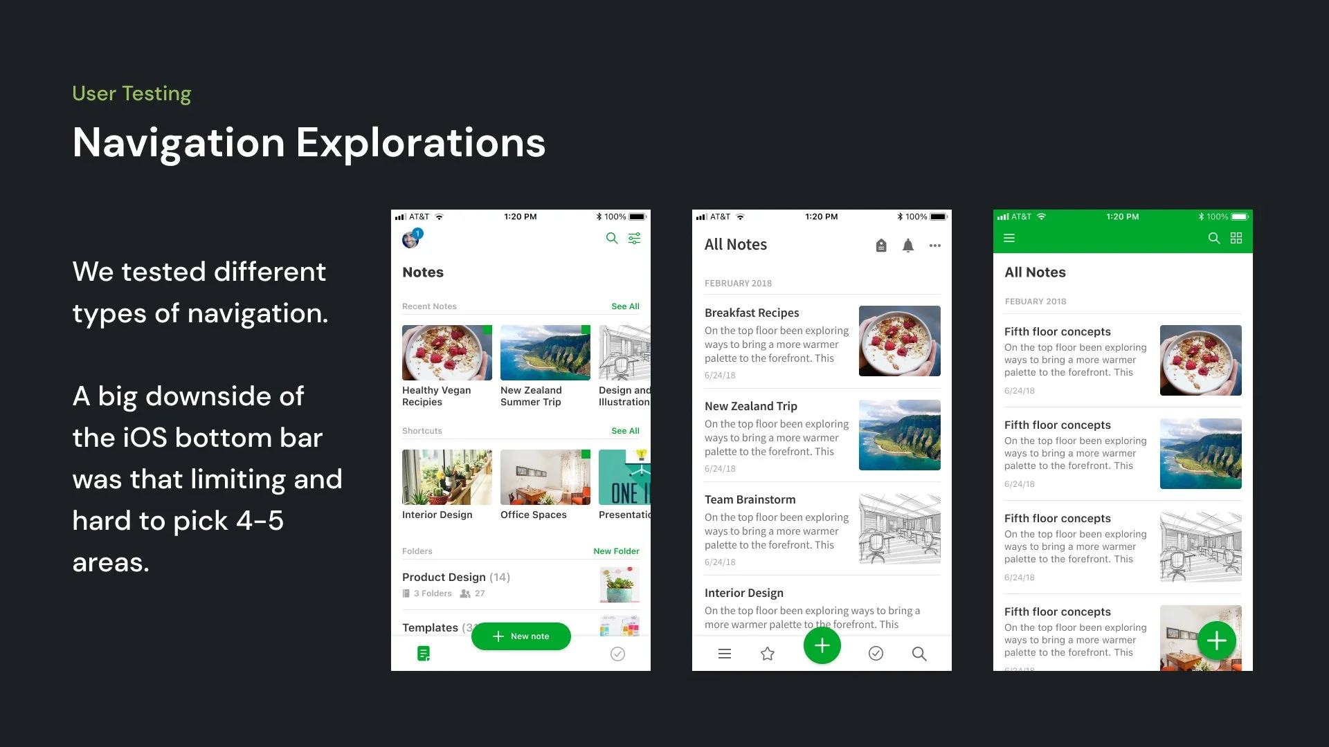
Navigation prototype I made in Figma
Editor prototype I made in Figma
Evernote’s History
One of the first apps on the iPhone, Evernote has been around for a while.
Some users have been using the app for over 10 years. Around 8 million people use the mobile app monthly. This meant any small changes had a big impact. We wanted to improve the app but also had to be considerate of existing user flows that users were accustomed to. People don’t always like change!
Two different apps
Built by two separate teams, the iOS and Android apps had a different designs. We were now building one app that was going to be rendered on both platforms so the two needed to be consolidated. They had some major differences in overall visual language, navigation and interactions.
Results
We successfully launched the new mobile apps in 2021 and it was very popular amongst our users.
The redesigned app was the winner of the 2021 People's Voice Webby Award for Work & Productivity Apps and Software.
Consistent experience
We now had consistency across all of our platforms, which was a big goal of the redesign.
New iOS App Trailer
Featuring our new app. Made by our marketing team.
Content
A video I made with the CEO of Evernote about improvements on mobile.


